
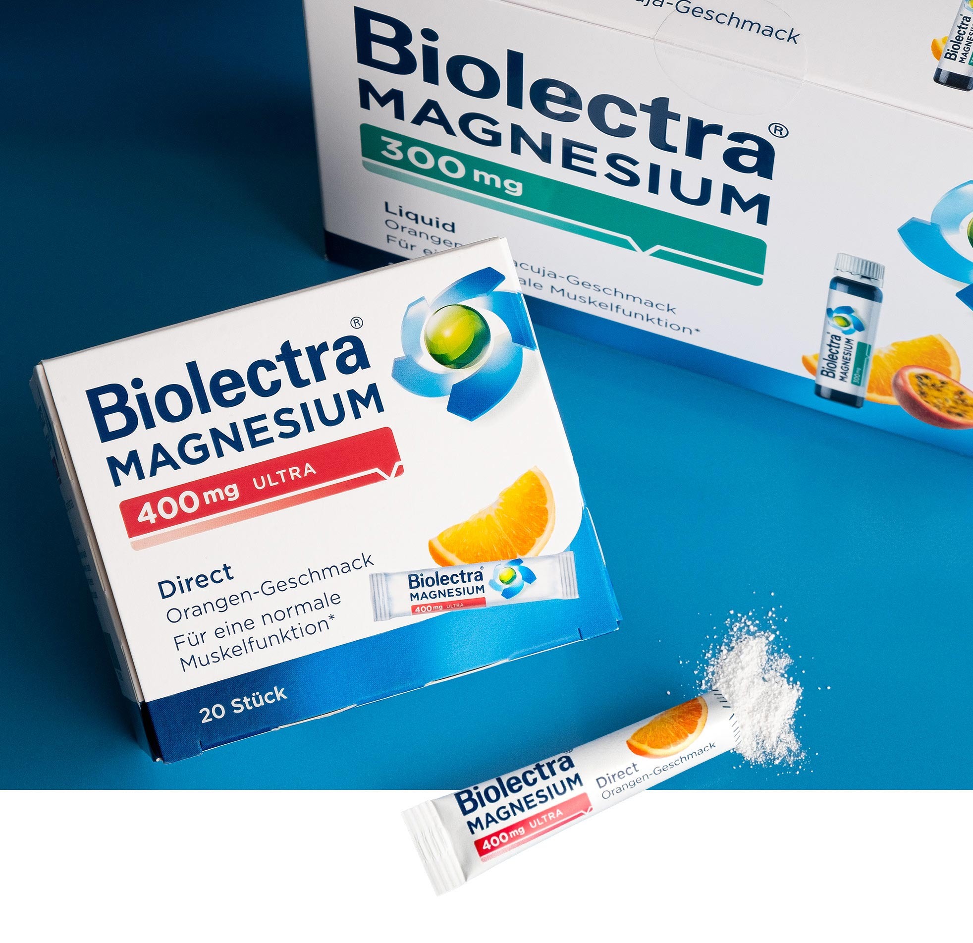
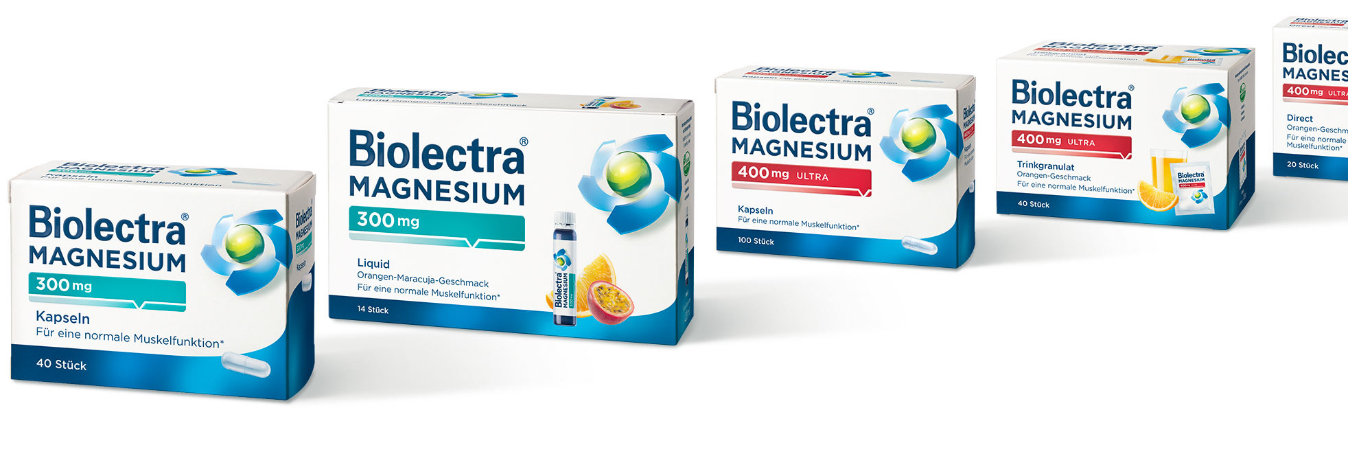
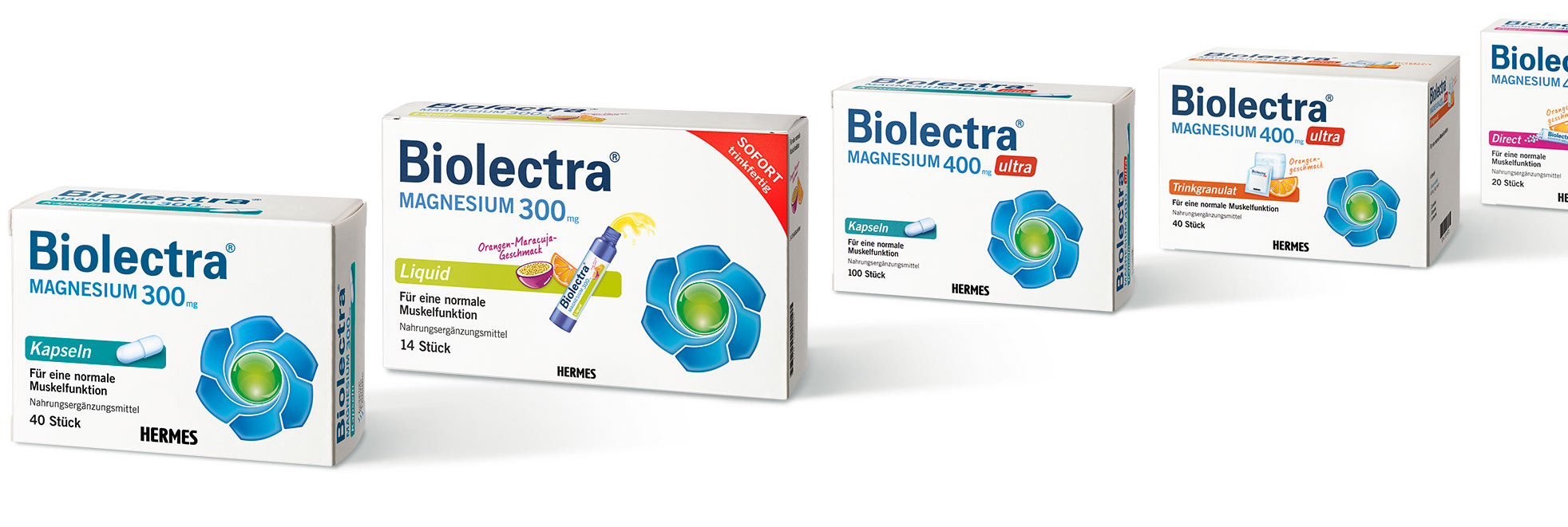
Clear, concise and restructured: Biolectra shines brighter than ever after its communicative realignment.
Clearly recognizable administration forms and flavors. Eye-catching new designs with activating key visuals. Restructured packaging communication with active ingredient scales.
To put it simply: it’s a well dosed relaunch for one of Germany’s best known magnesium brands.
Package design for magnesium compounds
The right dose every time
What we did for Biolectra:
-
Package design
communicative realignment of the entire range, e.g., restructuring according to dosage strength, activation of the brand’s key visuals and relaunch of the brand/package identity -
Print materials
creation of overall designs and print templates according to LMIV & EMA specifications