
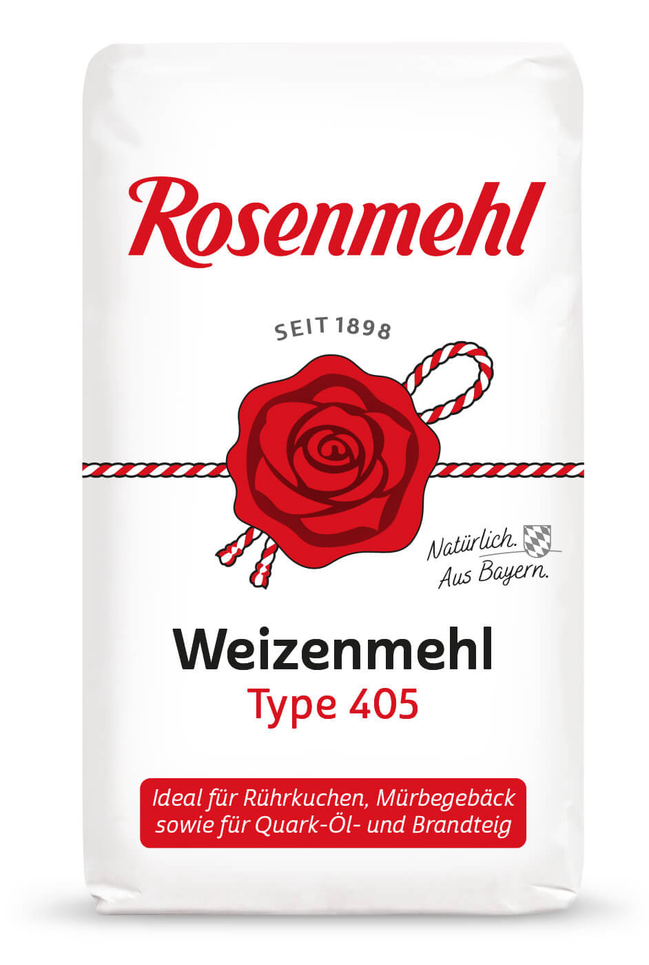
Brand & Packaging Rosenmehl

A piece of Bavarian family tradition

Rosenmehl is Bavaria’s market leader. 
To ensure it remains so, we have further developed the brand identity of this iconic brand.

Rosenmehl can be described as a‘lighthouse’ brand: wherever the rose shines at the point of sale, there is the flour shelf.
The rose seal is the core element of the brand. The new design of the rose ensures that the brand’s product range is instantly recognisable. Thanks to skilful printing techniques, the rose seal can now also be printed in the brand’s signature red.

Improved navigation at the point of sale 

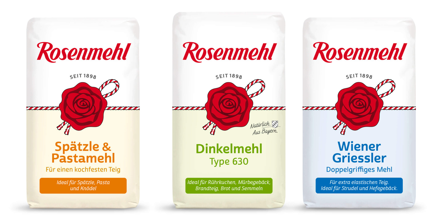
Optimal differentiation of the speciality flours

The respectful treatment of the brand icon has resulted in an impressive new expression of the brand’s ethos and meets the expectations of Rosenmehl fans. Artisanal quality, Bavarian heritage and tradition, the classification of individual flours and, consequently, clear differentiation between varieties, are the result of the redesign of all brand and packaging elements.
360° Communication

Information, Inspiration & Appetite

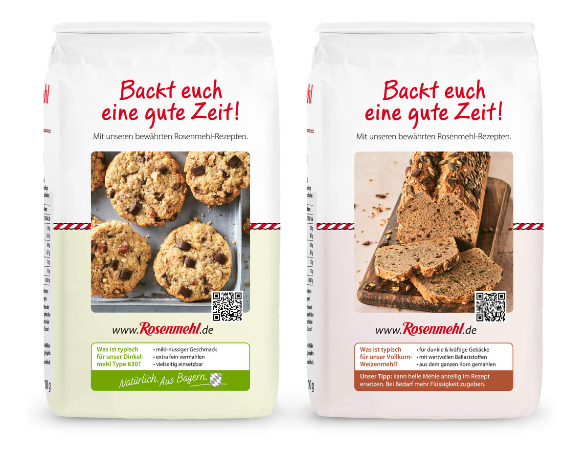
The packets are designed to be informative and inviting from every angle. On the back of each of the twelve varieties, there is a recipe image specific to that type of flour. A QR code takes you straight to the recipe section.

What we were able to do for Aurora Mühlen GmbH:

  • Brand identity

    Relaunch of the brand identity and all associated brand ele-ments.

  • Packaging design

    Development of the packaging design and all-round communication. Adaptation of the brand identity for folding carton products.

  • Implementation

    Development of the photographic concept, photography direction and image editing. Print files/artwork for 12 variants and adaptation of the design to other pack sizes. Proofing process and final print approvals.

  • Secondary

    Adaptation of the brand identity to various tray versions.