
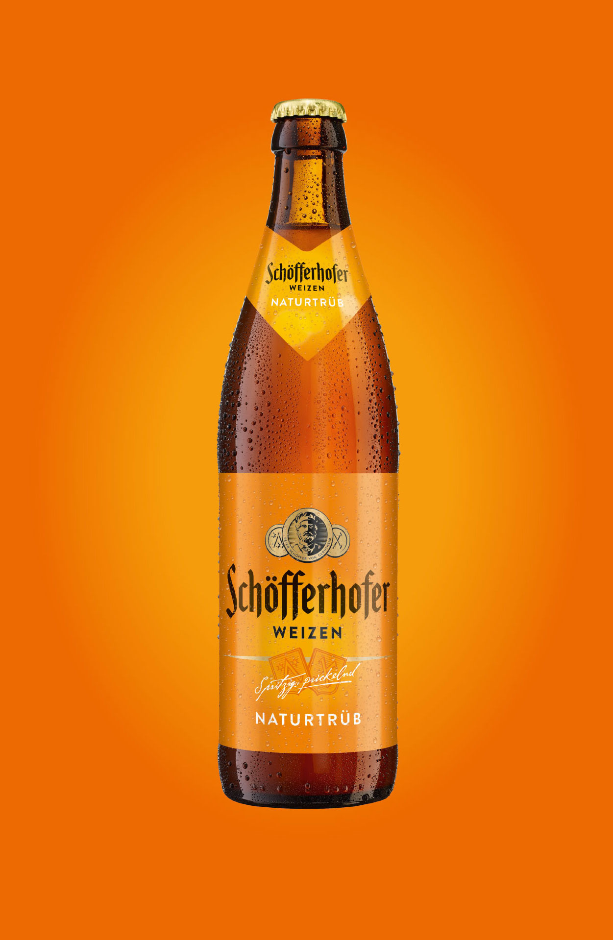
The brand: Schöfferhofer Weizen is one of Germany’s largest wheat beer brands, so much so that it’s practically used as a generic term for the entire beverage category. The catchiness of the color orange as an expression of the brand’s identity is decidedly unique in this beverage category.
Our task: a comprehensive brand relaunch based on a repositioning approach aimed at establishing the Schöfferhofer brand as a contemporary/urban answer to the clichéd traditional Bavarian wheat beer stereotype.
The result: a truly outstanding brand and design relaunch. This masterful interplay of qualitative brand management and strategic reorientation is balanced, down to the very last detail. Tight, clear, reduced to the core essence of the brand and with an innovative yet timelessly beautiful expressiveness. Schöfferhofer Weizen: a cutting-edge classic.
Package design for beverages
Orange Hour
What we did for Schöfferhofer Weizen:
-
Brand identity
Development of a qualitative brand relaunch in the context of an overall strategic brand realignment -
Features
Qualitatively detailed revision of all relevant brand elements (lettering, coat of arms, variety declarations, etc.) -
Package design
Implementation of the new master design for 4 product varieties -
Secondary
Development of a design concept for the six-pack and beverage cans, and implementation of the master design for all varieties and containers -
Print materials
Creation of comprehensive designs, size adaptations and print templates