When we were asked to develop an idea for reimagining the logo of the HABA family of companies, we first had to get to know who HABA is and what HABA stands for. That there are two HABA's: the family of companies and as one family member the product brand HABA. We got to know the other family brands, learn what everyone has been doing for the last eighty years and understand that the building block has a special symbolic power as the original product of the company.

We often associate the contradictory adage "less is more" with a sort of aesthetic diet or pale coolness. But why should you want to take something away when – after all – more is more?
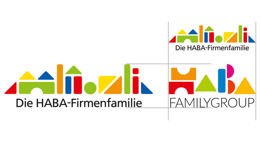
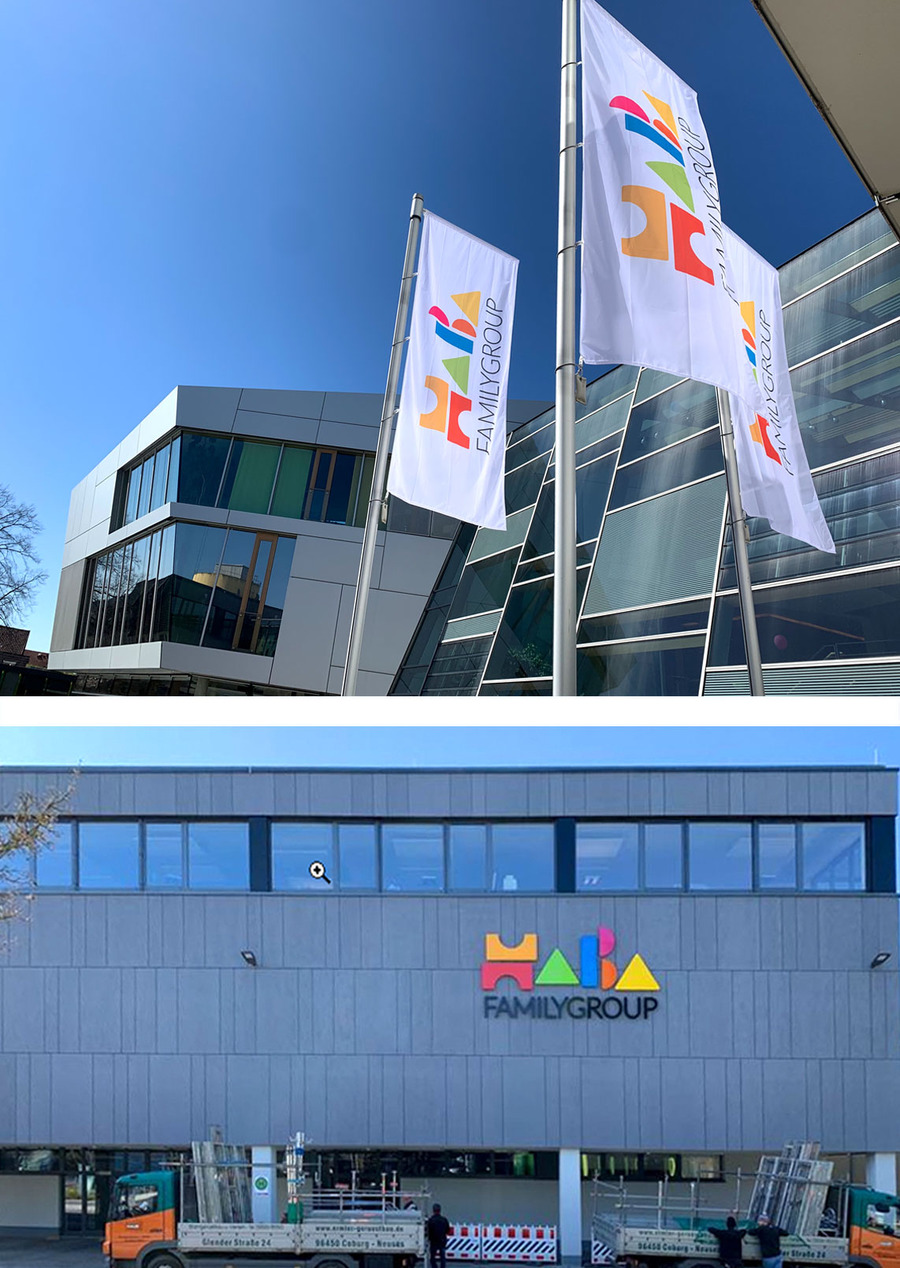
The HABA corporate family logo consists of thirty-six individual parts - pictorial symbols and letters. "Less" becomes "more" in the new HABA Familygroup logo, because we significantly improved the functionality of the logo – it’s clearly identifiable in all image sizes. For statisticians: the thirty-six individual parts were reduced to eighteen. Renaming HABA as Familygroup made it possible to halve them.
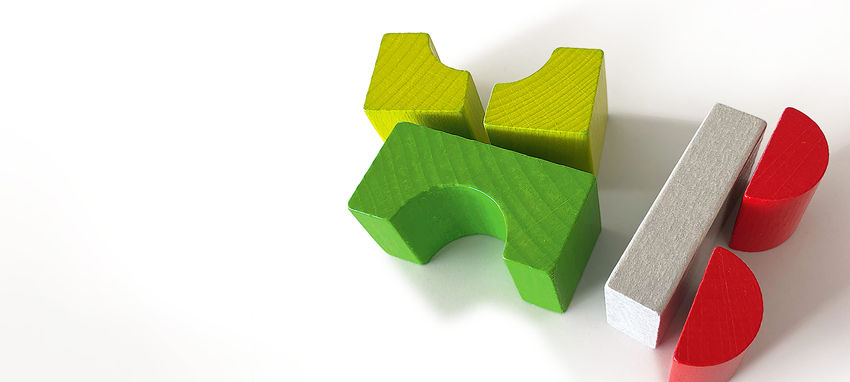
The building block makes the difference. The conciseness of the logo could only come about through the rededication of the building block from a decorative pattern to a meaningful expression of the name. The childlike, playful assembly of the colorful building blocks illustrates the origin and meaning of the company. The HABA Familygroup logo symbolizes the unity and preservation of the creative diversity of its people and brands.