Brand design for Müllers Mühle

‘Go Willi, go!’

Müllers Mühle is renowned for its excellent range of pulses and is the market leader in this sector.

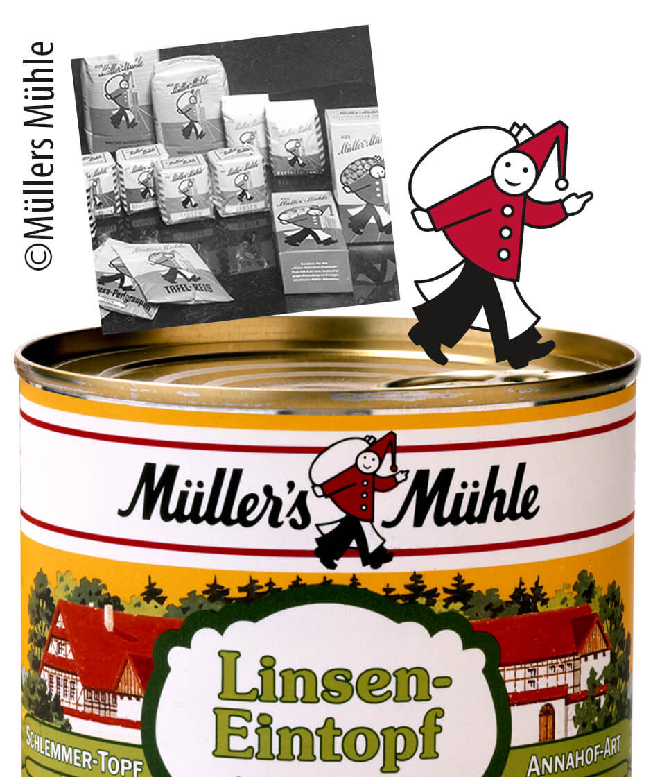
For over a hundred years, the ‘Müller’ from Müllers Mühle has been a defining feature of the brand’s image. Probably due to the success of ‘Willi’s 5-Minute Rice’ in the 1970s and 1980s, he is affectionately known internally as Willi.

In the 1920s, he still appeared somewhat weighed down by the burden of work, but subsequently became increasingly optimistic. We were keen to embrace this remarkable attitude to work and have also given the ‘new’ Willi a smile.

Historical: the brand logo on a stew from the 1980s.
Forty years ago, the brand mascot became a central part of the word and design mark. Interestingly, it was developed by bmr.

The relevance of the offering

The strategy determines the expression

Lentil stew and pea soup are delicious and still have a loyal following. Yellow lentil dal, hummus and kidney bean burgers are now popular dishes and symbols of change. Pulses appeal to an enormous range of target groups with very distinct demographic characteristics, a wide variety of lifestyles and occasions.
The brand and brand style had to be revamped to improve perceptions of the brand’s performance and to reaffirm the relevance of the product range.
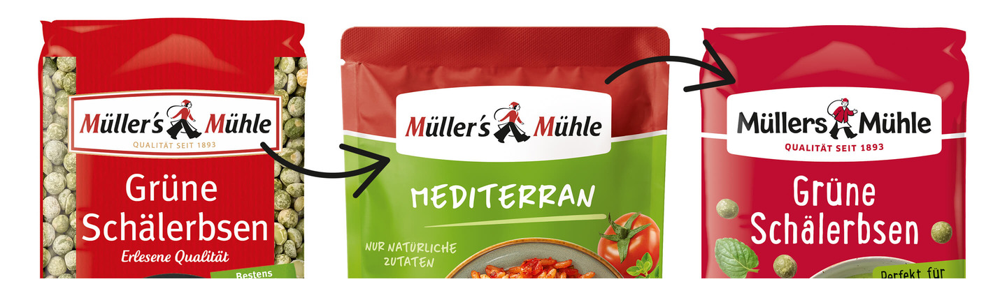
The brand had already been streamlined in time for the launch of the ready-made rice dishes. By optimising the brand identity and brand management,
we created an interim solution that formed the basis for the substantial overhaul of the brand as part of the relaunch of the pulses range.

Craftsmanship and Tradition

A brand name derived from historical cursive script, later featuring initials in red, a lined border and a quality statement in gold, reflects conventional values. This also made functionality – such as the easy legibility of the brand name at the point of sale – more difficult.
The aim was therefore to ensure the complex word and figurative mark could be recognised, whilst also enhancing the traditional brand’s expression of artisanal quality.

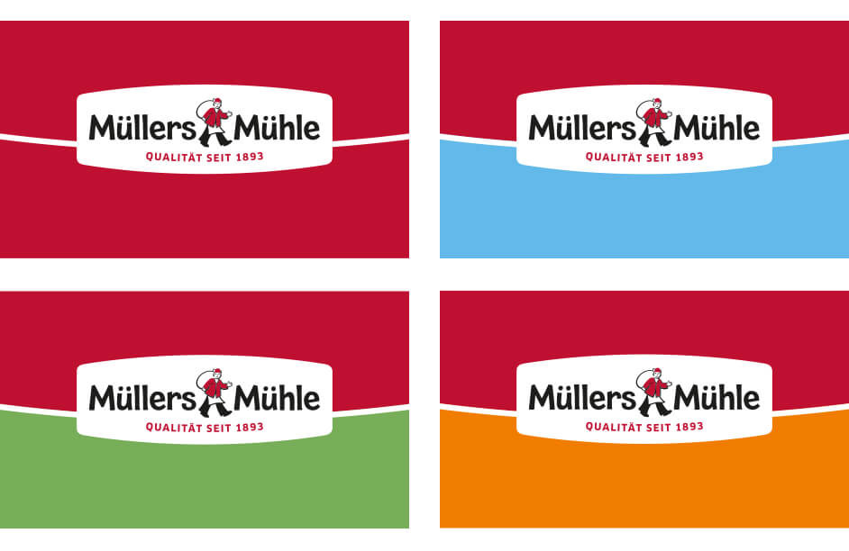
The brand colour red is a more striking and sophisticated choice.
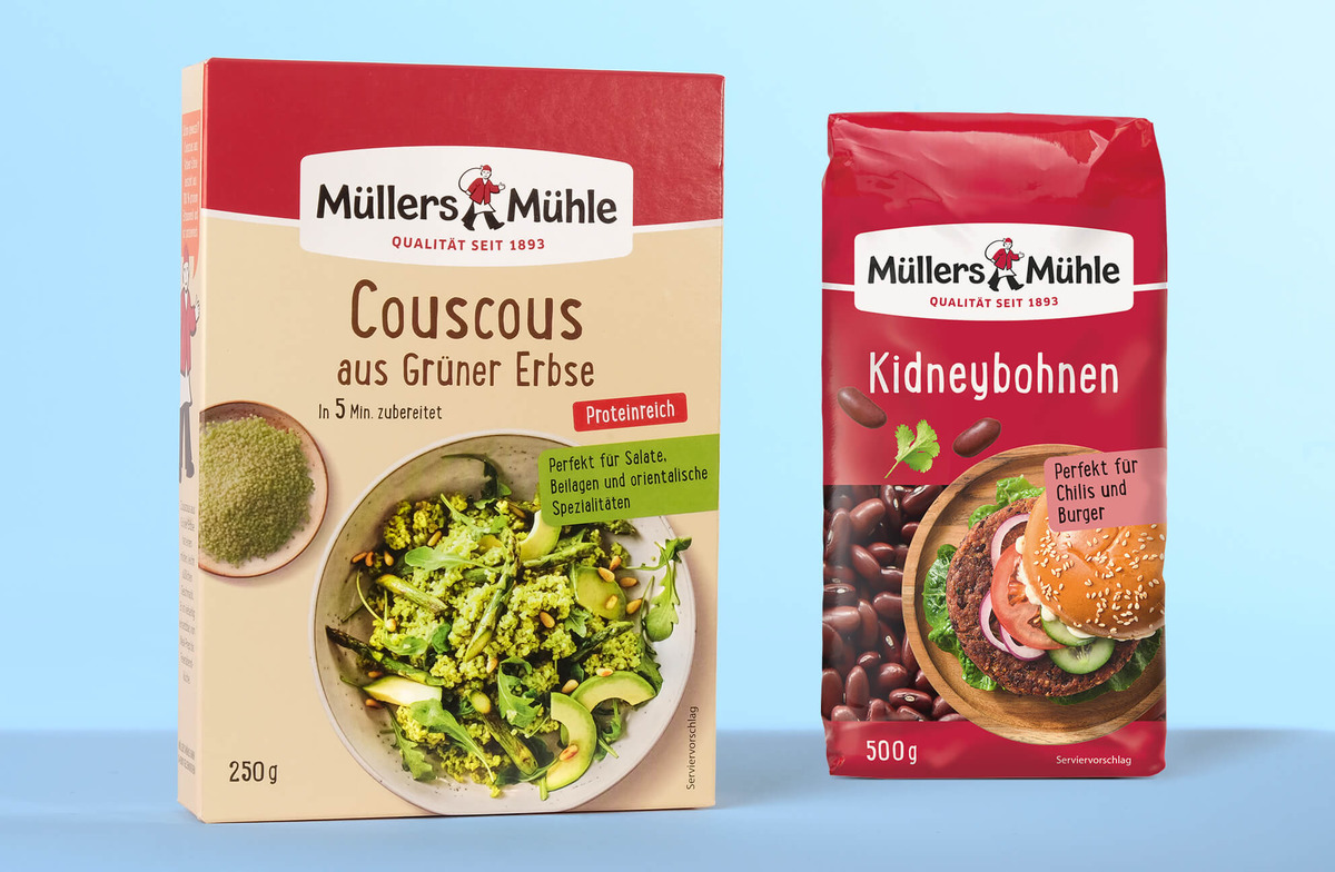
The visual brand identity on all product packaging is consistently applied within the framework of a defined brand umbrella.