
Good design can be deceptively simple. The same goes for quality dairy products.
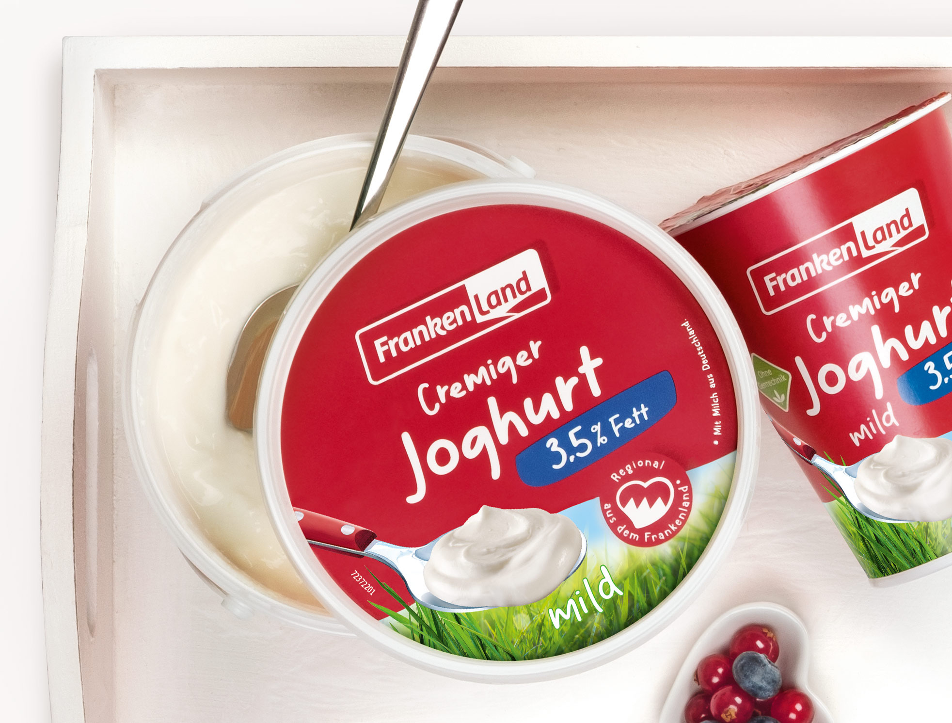
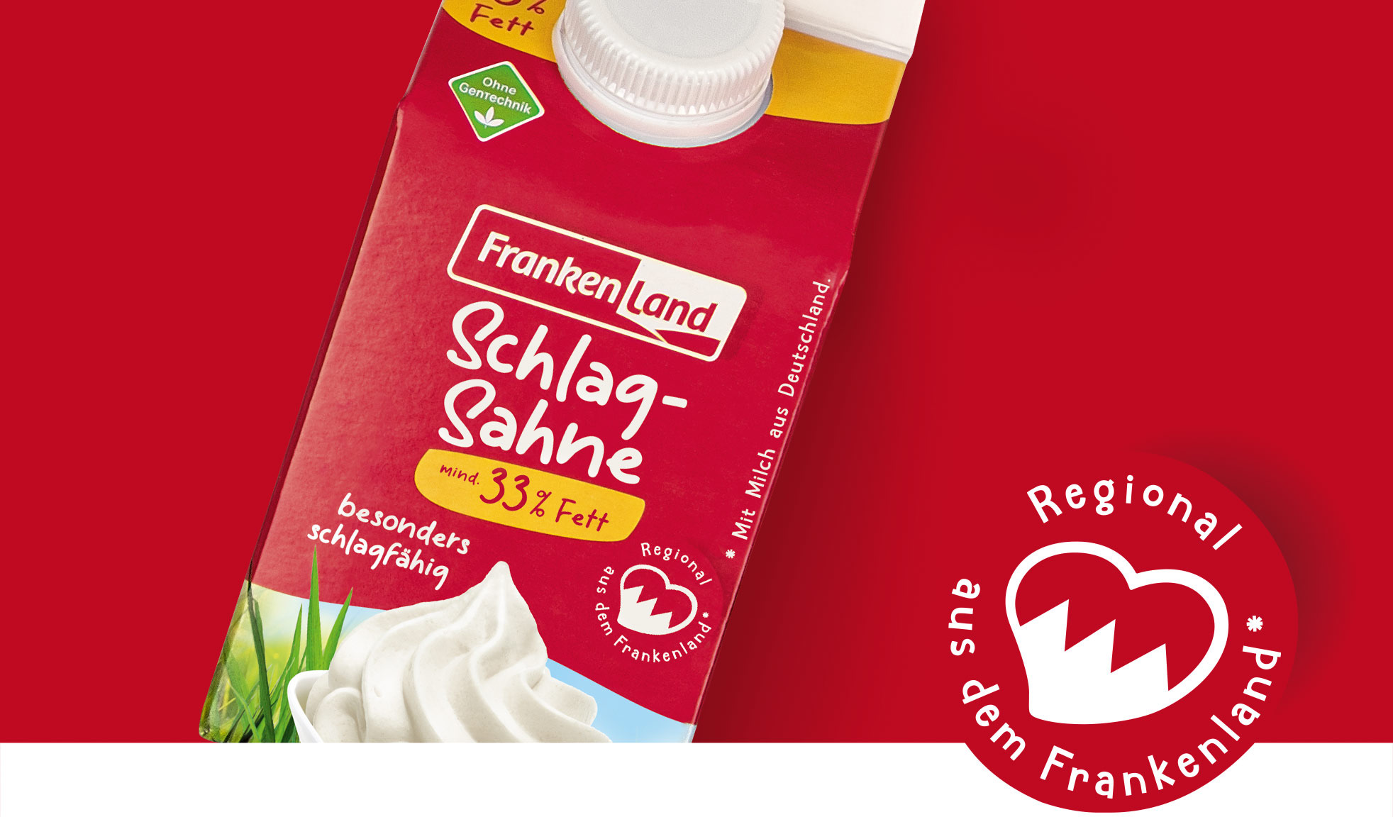
Good milk from Franconia is red-white.
Package design for dairy products
Regional at heart
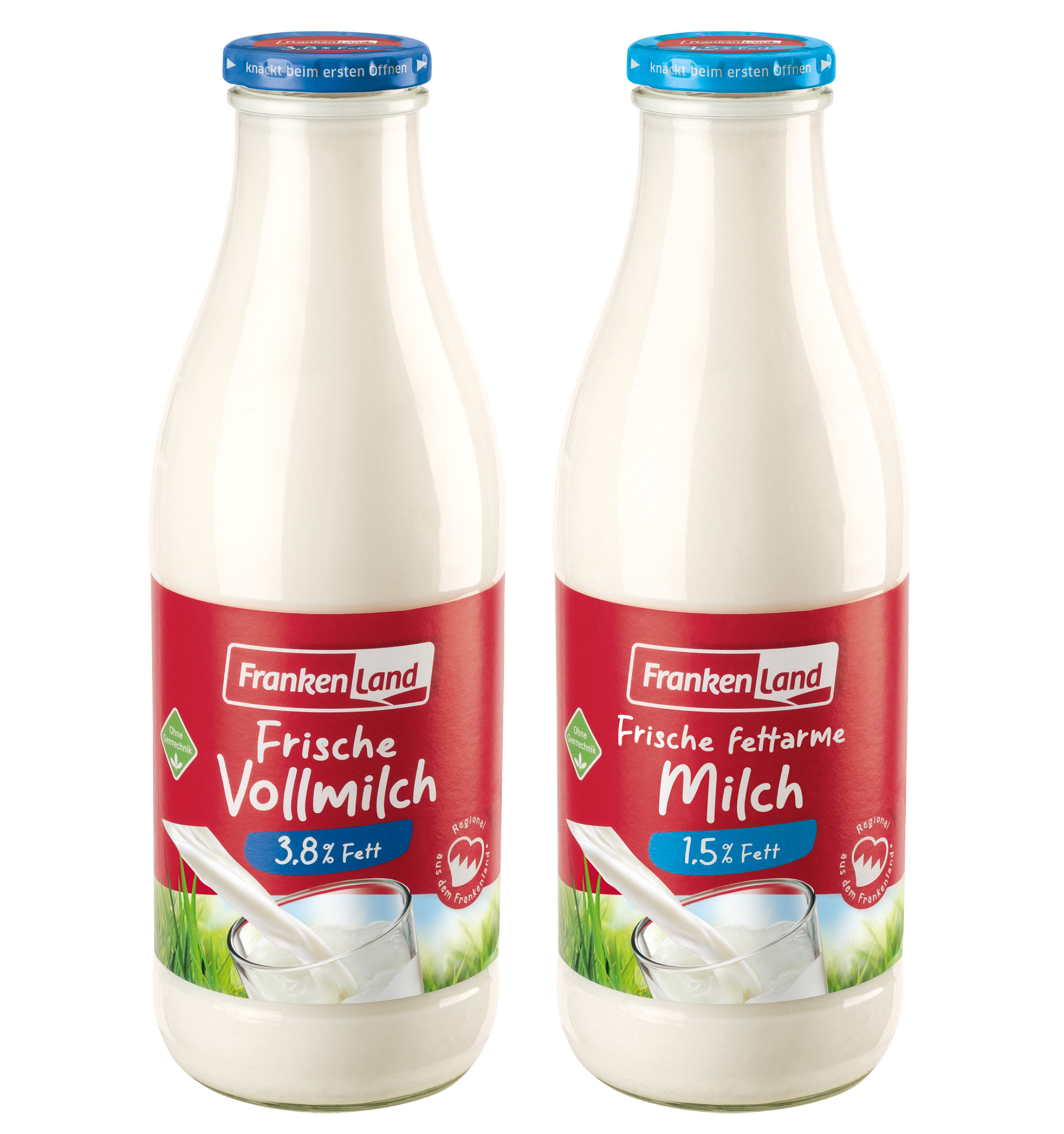
The colors of Franconia’s flag sends a strong signal at the POS. Coupled with the Franconian heart, it emphasizes how regionally anchored the brand is, namely in the Frankenland, as this area is called in German.
Typography and clear communication make the brand both approachable and likable.
The product communication is pared down to what’s relevant while clearly conveying the flavor and quality – simply good.
What we did for FRANKENLAND:
-
Logo design
Evolutionary update of the Frankenland brand logo -
Package design
Launch of a unified brand appearance in Franconian red, that emphasizes its regional origins and sends a confident signal in the refrigerated section. Roll-out across all product lines for both food retail and specialty wholesale. The switchover of all 167 products took place within one year. -
Print materials
Creation of all round designs and print templates -
Advertising materials
In line with the launch, we were also commissioned to design Frankenland’s new trade fair presence and POS materials.