The mother bear is beaming because the little one is obviously very happy. The fundamental renovation of the brand logo was at the beginning of the package design development. The umbrella brand concept masters the challenges of brand and product diversity in the MoPro segment.
We developed an umbrella brand concept that defines the likeable uniqueness of the products and bundles the product range powerfully while fulfilling the shopper's desire for clear orientation.
Nothing beats Bärenmarke. A claim as a guiding principle. The new design of Bärenmarke: more radiantly beautiful than ever before.

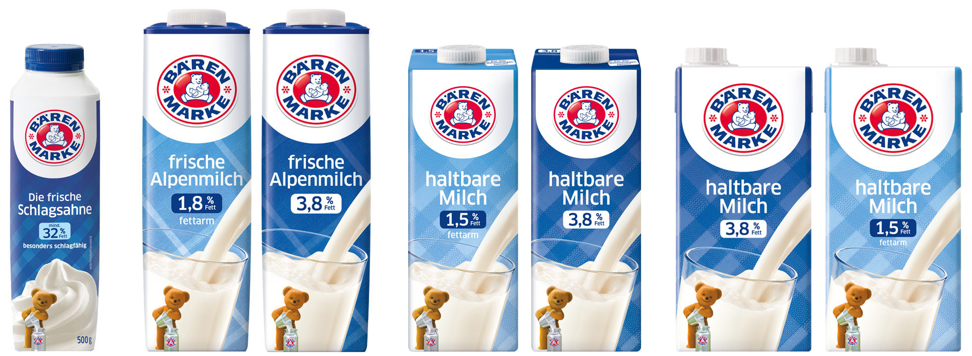
Sustainable umbrella brand concept
Making growth possible
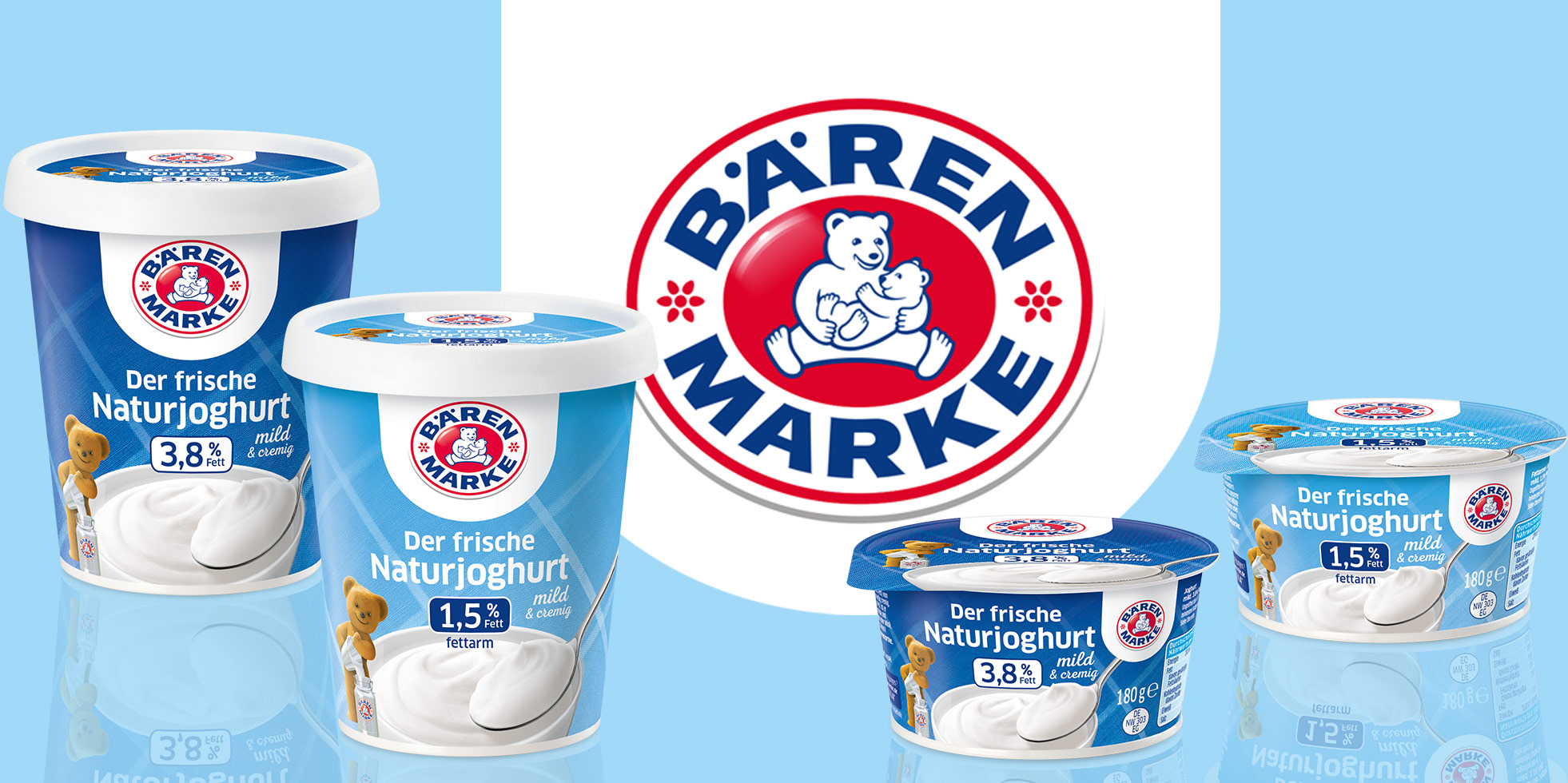
The natural yogurt from Bärenmarke: as familiar to shoppers as if it had always existed. The brand relaunch we developed enables significant branding and clear identification of all new products at the POS. We let the familiar promote even more trust among consumers.
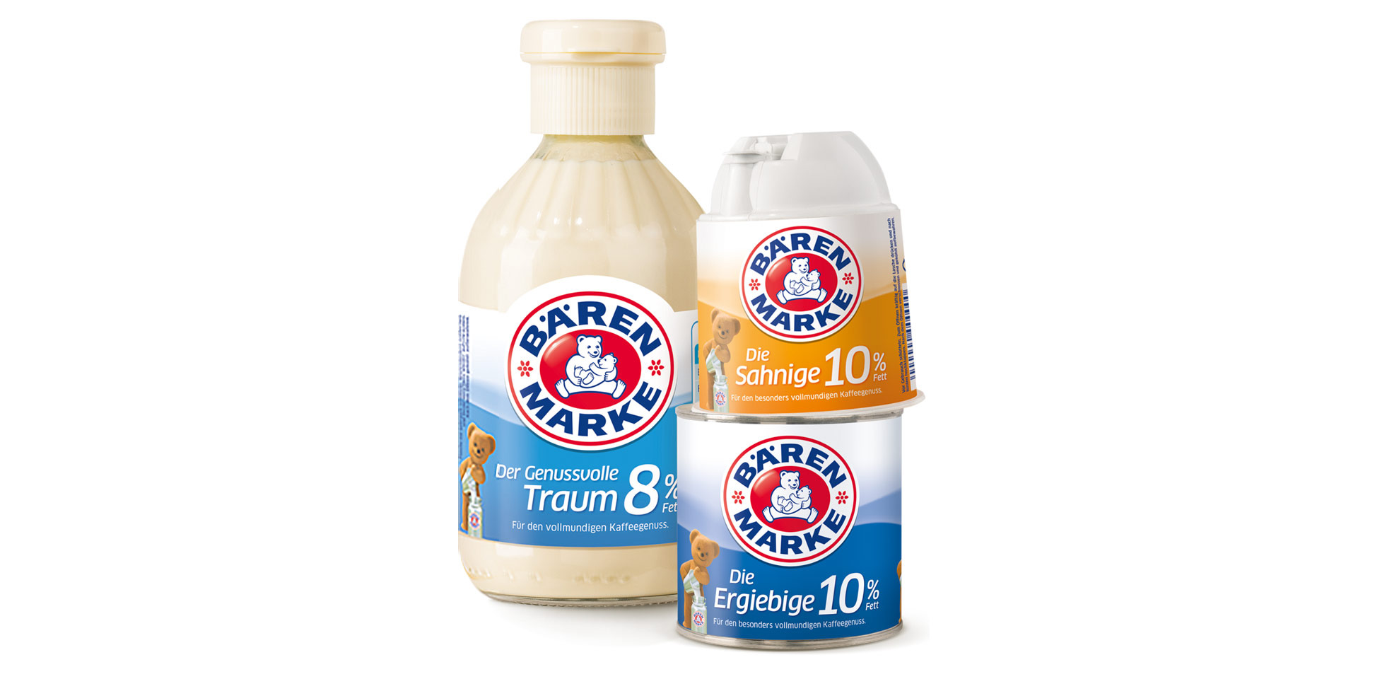
Package design condensed milk
Creamy, dreamy
The original product of Bärenmarke is condensed milk. After more than a hundred years, condensed milk is still an enjoyable dream for many and is as much a part of drinking a cup of coffee as the coffee itself. Over the years, the monoproduct has grown into a small range with six unique flavors. The variety of types and containers creates a dominant, but also complex image at the POS. In addition to brand identification, learned color codes and the clear communication of fat levels are functional requirements here.